
Wyndham Hotels & Resorts App
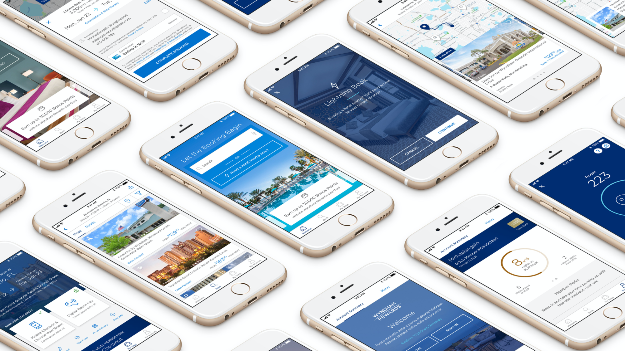
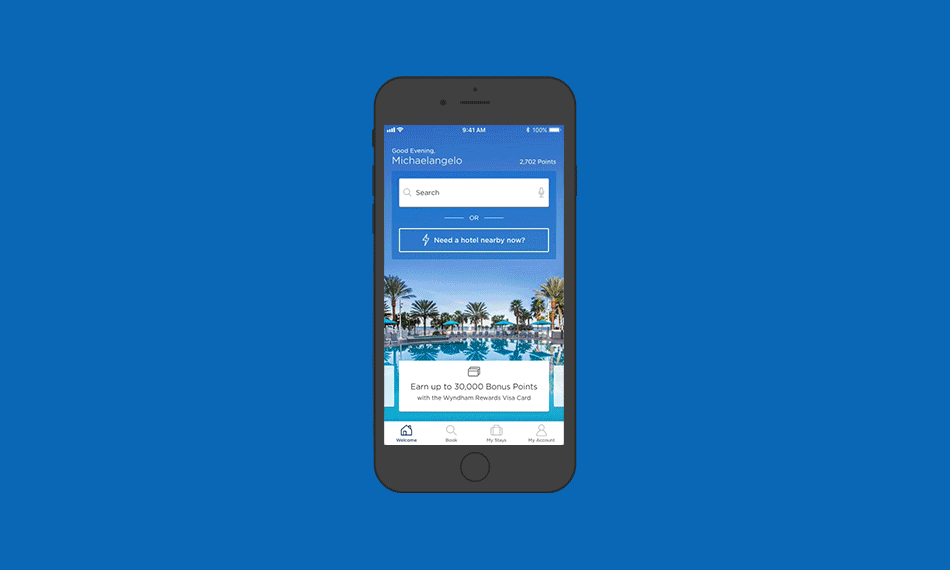
The re-imagined Wyndham Hotels & Resorts app arrived at the perfect time – when travelers are looking for more contactless travel options. With pivotal new features users are able to book a hotel in 3 taps with Lightning Book℠, stop worrying about keys with Digital Key, and skip the line using Mobile Check-In and Checkout. Increasingly, users expect their apps to bring personalization, in the moment features, and lightning fast results. The app we built does this, but not only that it's a beautiful experience while you're finding your next perfect stay.
When designing the new experience we wanted to embody the philosophy of our Wyndham Welcome so we approached everything from that point of view. We looked to create a stunning visual experience as well as build a strong foundation of best-in-class features that will evolve as our guests' needs evolve. We also addressed frustrations our guests had with the legacy app by conducting several rounds of user testing. We knew we had a good start but through research it was clear that speed, intuitive flows, variety of choice, and robust functionality would keep bringing guests back.
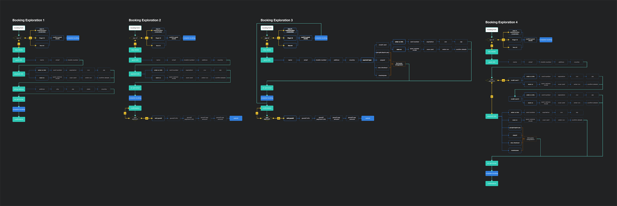
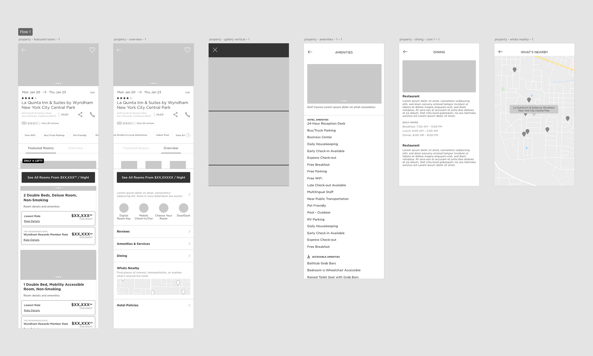
The journey users take to complete a booking is the utmost importance. To help streamline the booking flow we looked at several variations from the websites and the legacy app. A seemingly simple process but there are many steps a user takes before completing their journey.
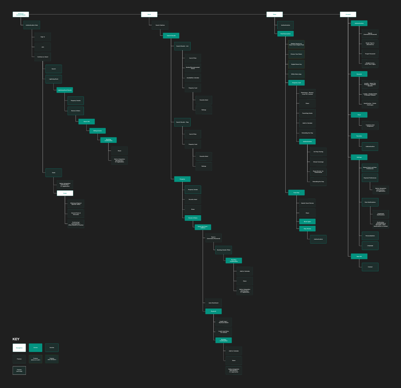
Once the four main navigation sections were agreed on, creating an App Map was the first steps in determining the remaining app IA. Some features are only available for Wyndham Rewards members so authenticated and unauthenticated user maps were needed. We used the App Maps as our guide throughout the entire project if we ran into scope creep or needed to align with the development team.
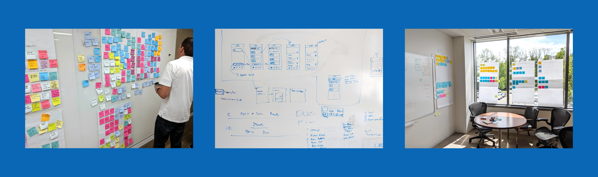
Throughout the project affinity boards, white boarding, and sprint planning were constant activities used to stay aligned with all team members.
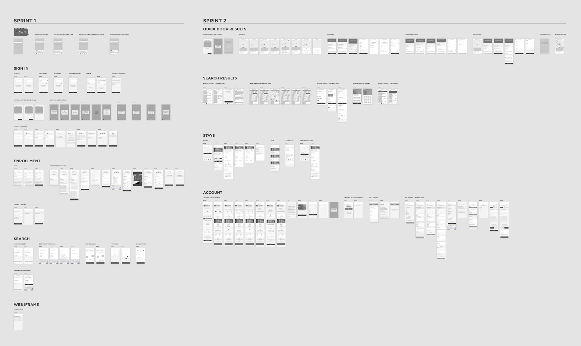
A set of wireframes from a couple of our sprints. Leading a team of UX designers through multiple sprints, of two weeks each, required diligent organization. Labeling each sprint and grouping of wires was crucial to keep everything moving smoothly.
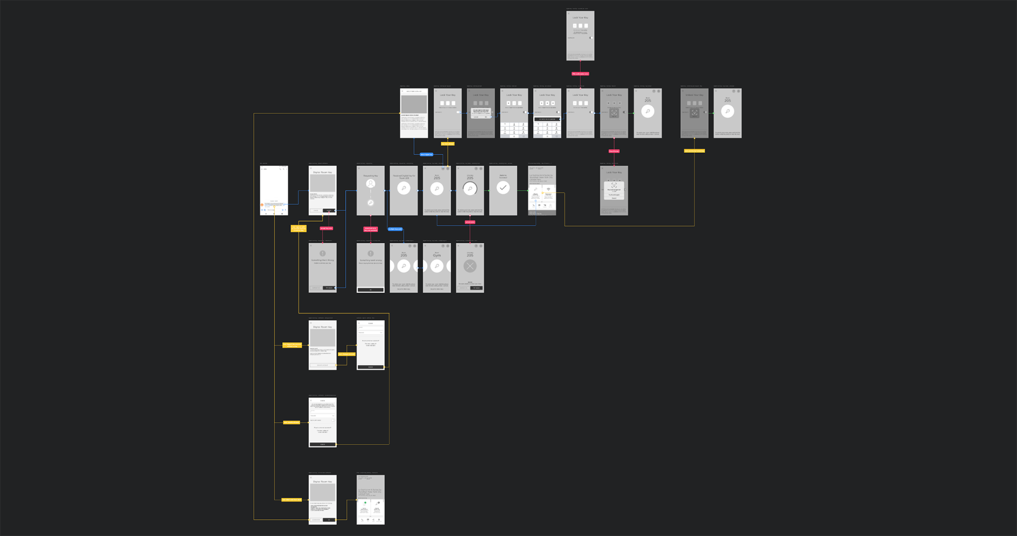

For more complex features, such as Digital Key, user flows were used to get buy in from the rest of the team. They were also used to quickly see gaps in functionality and find friction points.
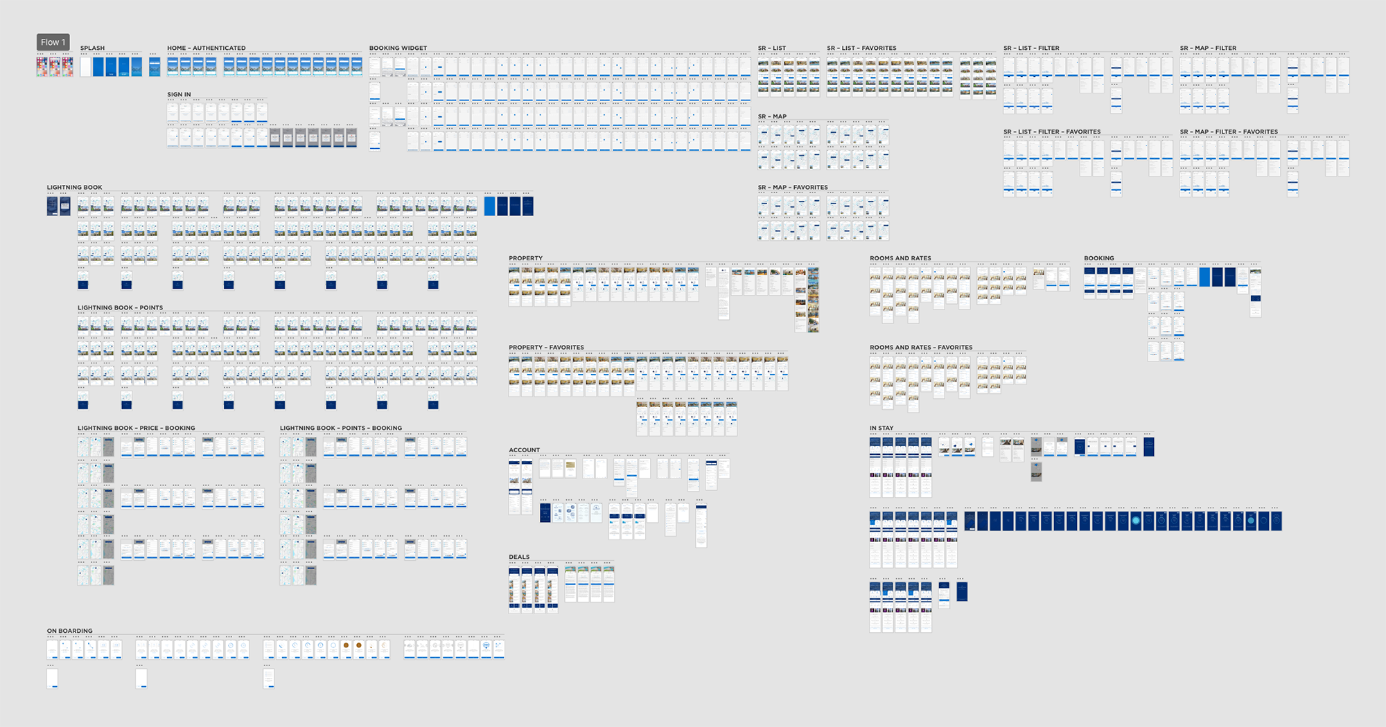
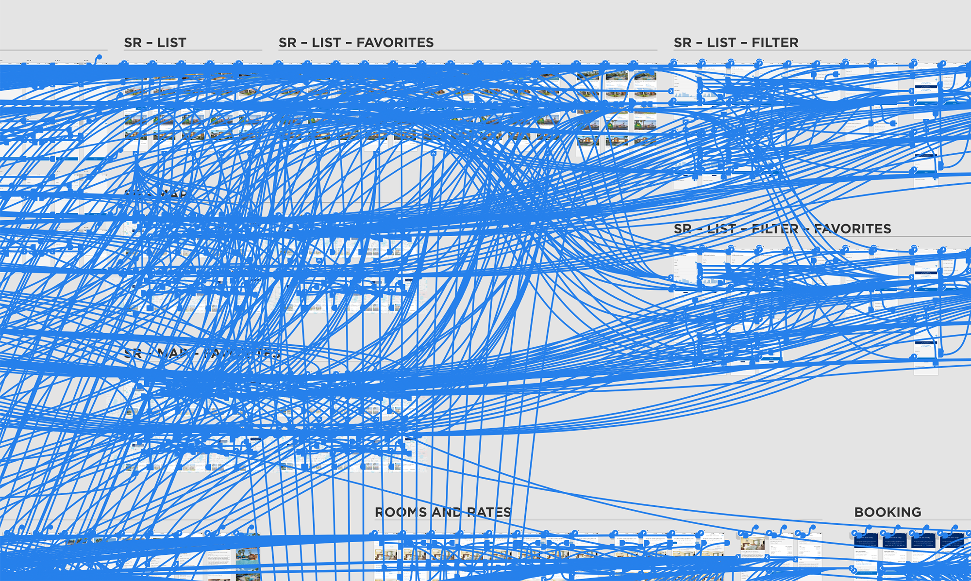
A high-fidelity and fully interactive prototype was created was the design phase came to a close. To showcase the app to senior leadership and get initial feedback prior to development I created an 820+ screen prototype, complete with transitions and animations.
The below image is a close up of the screen to screen connections within the prototype.
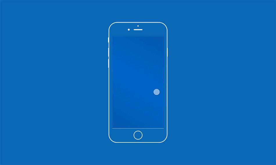
We used a sequence of onboarding animations the first time a user launches the app to introduce them to the new app features. We know users are generally busy so while we only highlight four features they can easily skip them and get straight to the booking.
High-Fidelity prototype of the app, includes micro-animations and transitions throughout. Prototype was used for user testing, development reference, and senior leadership buy-in.


